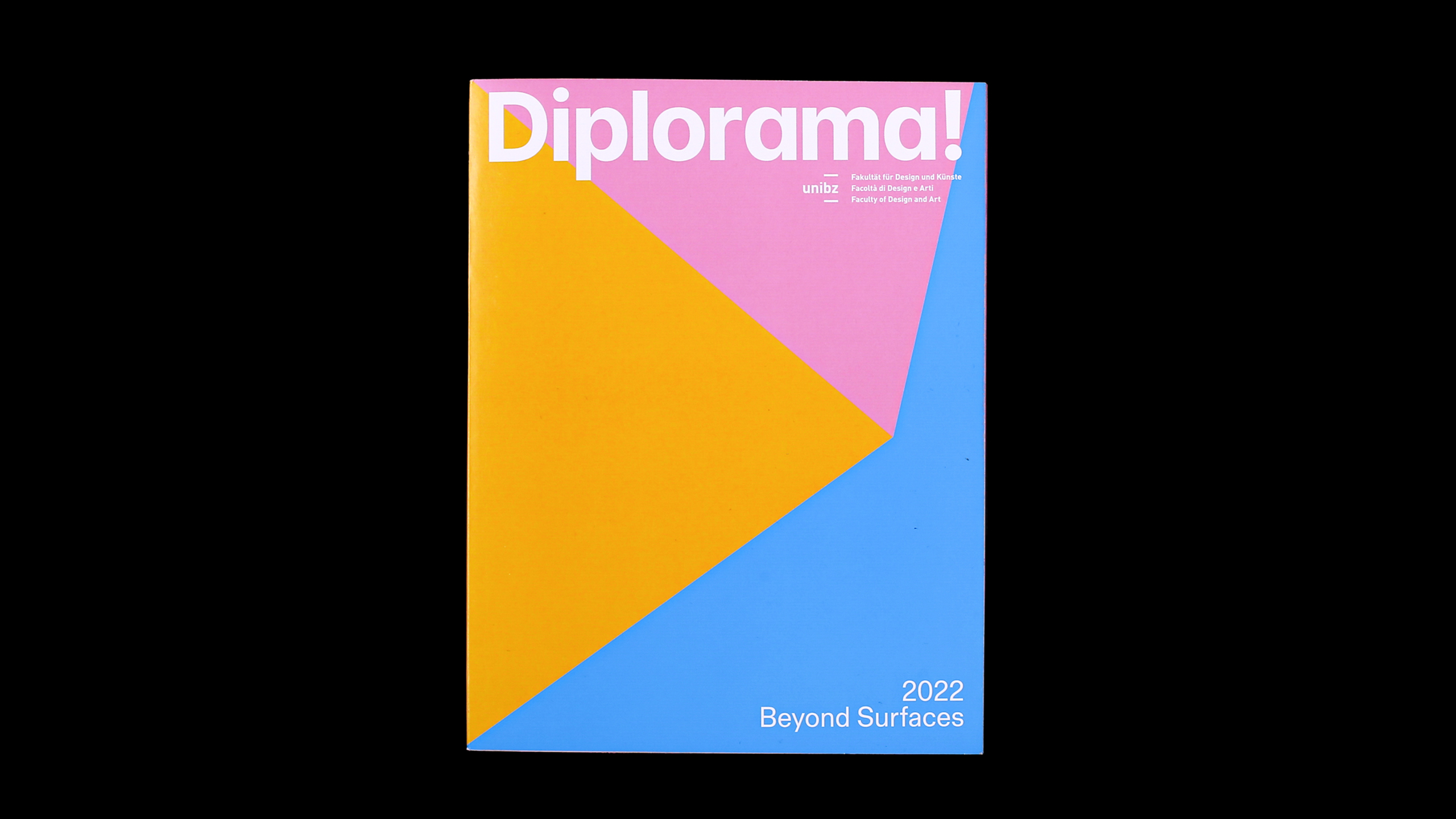
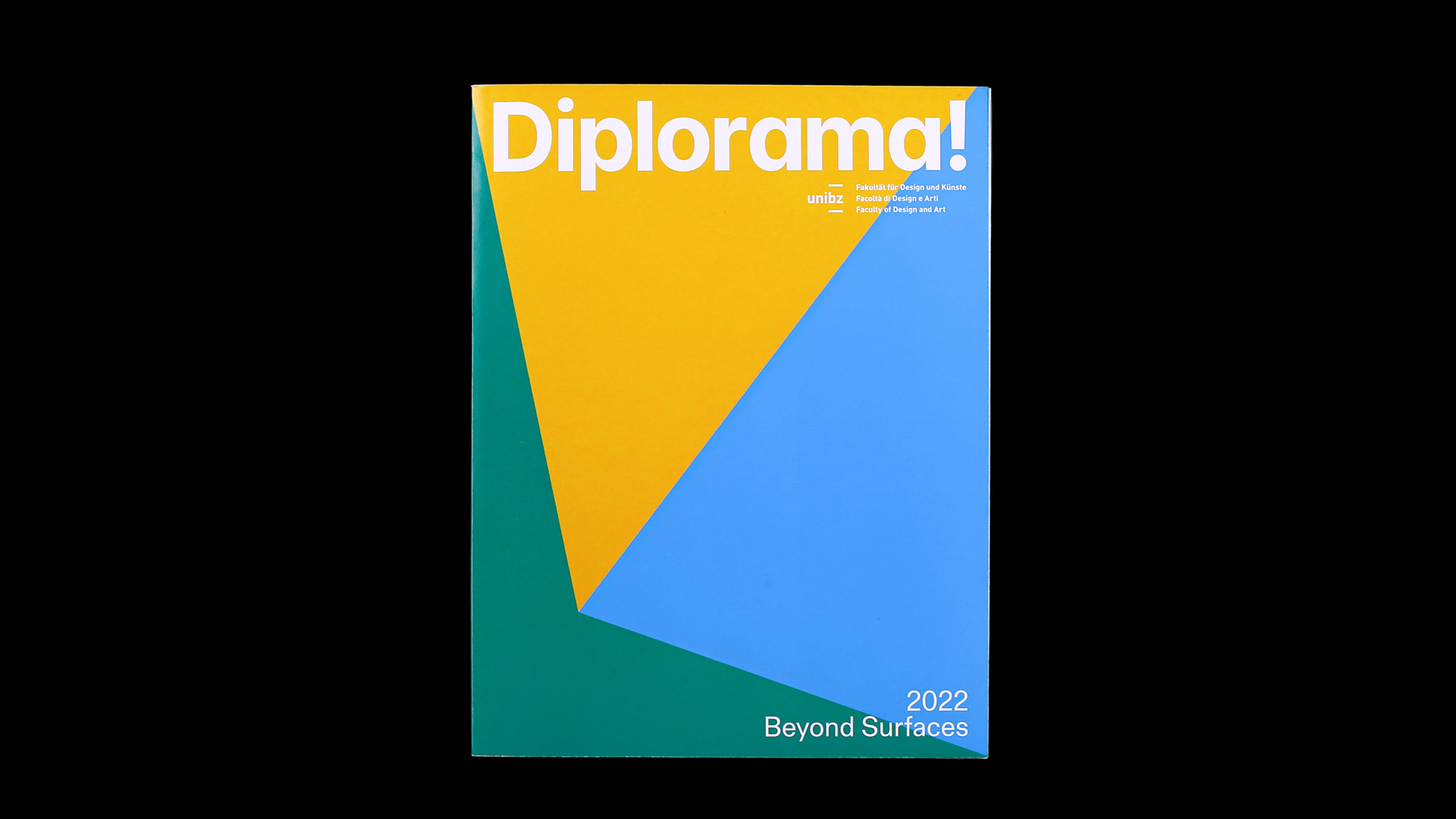
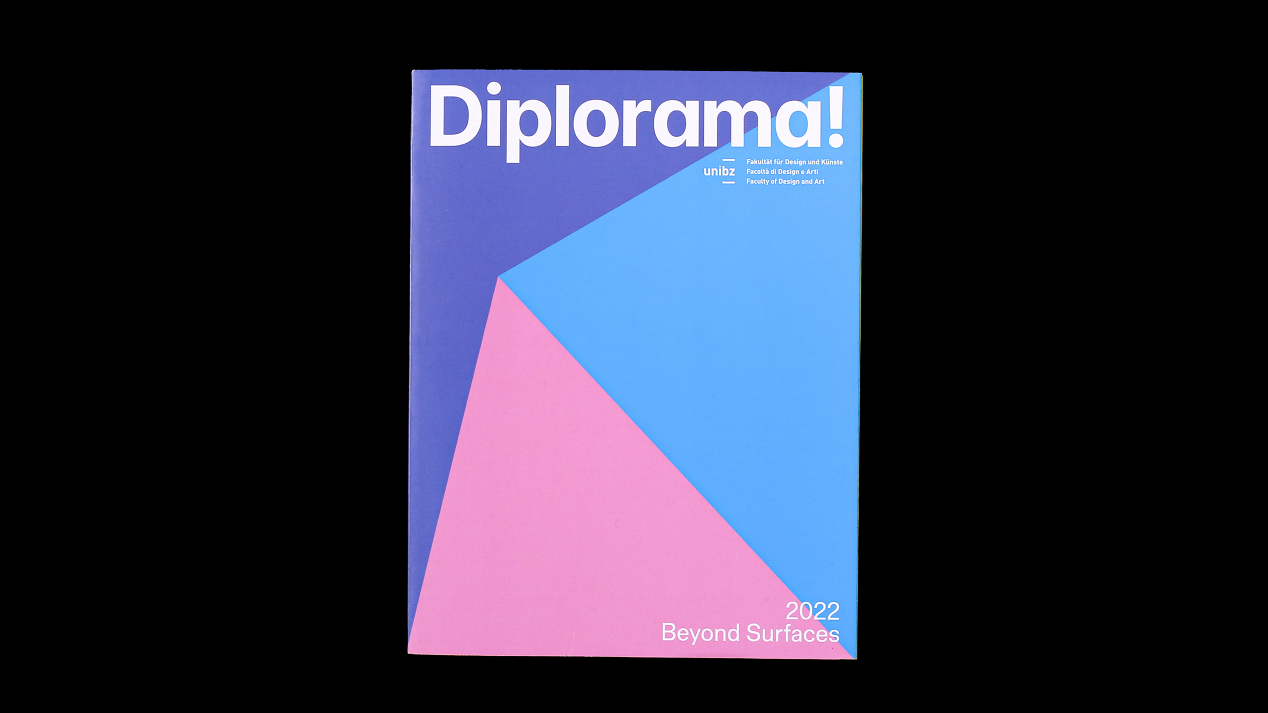
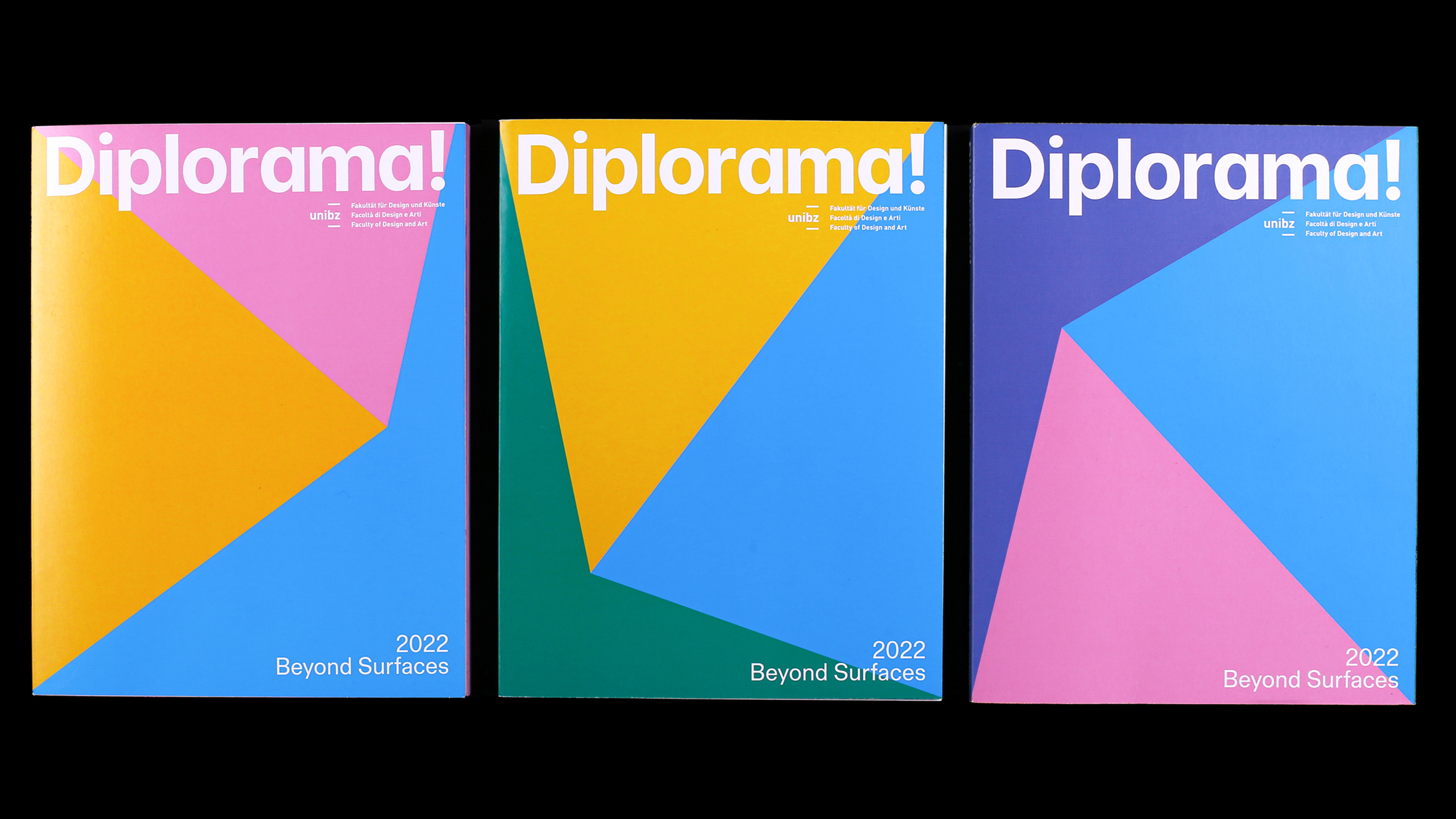
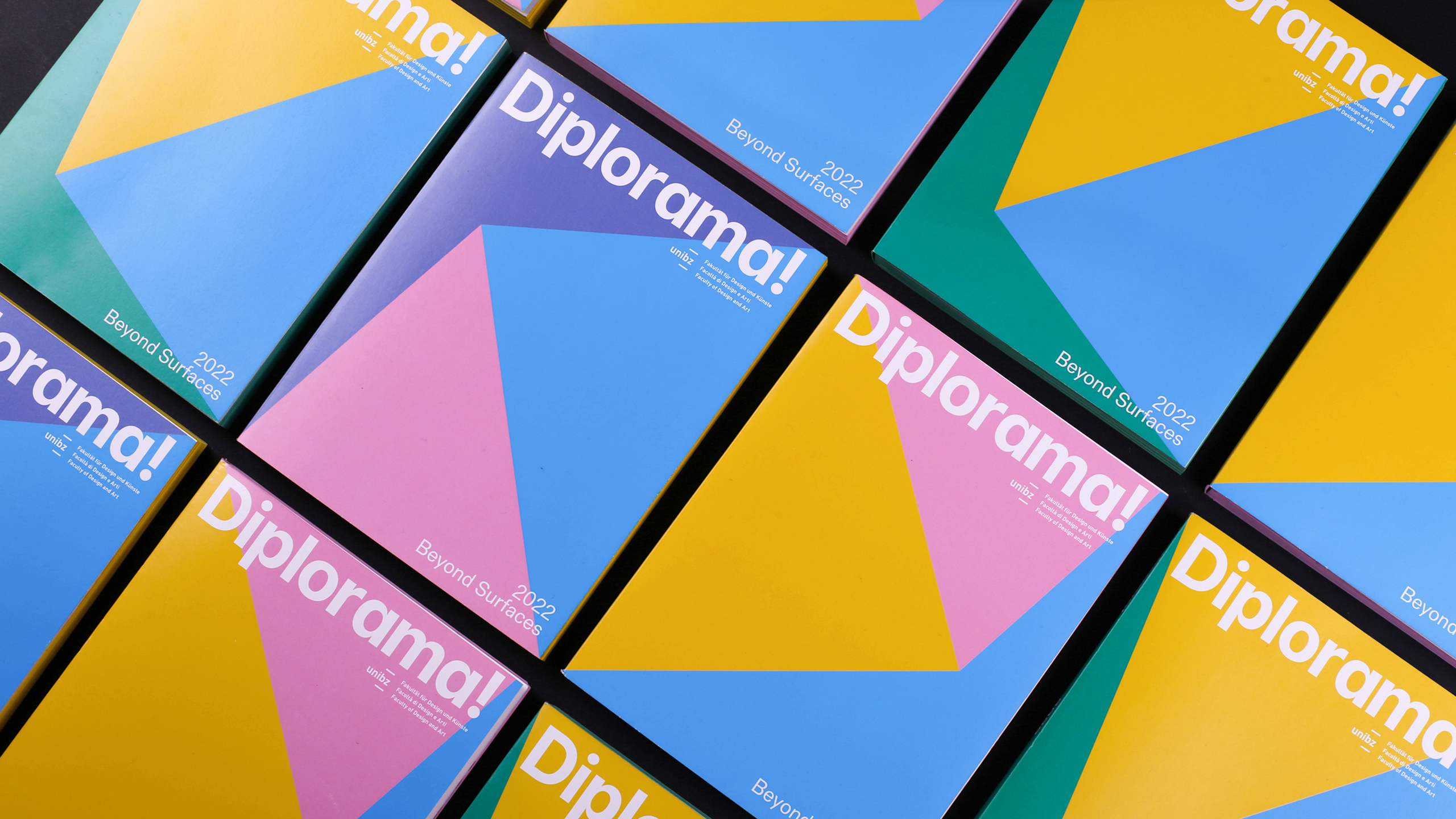
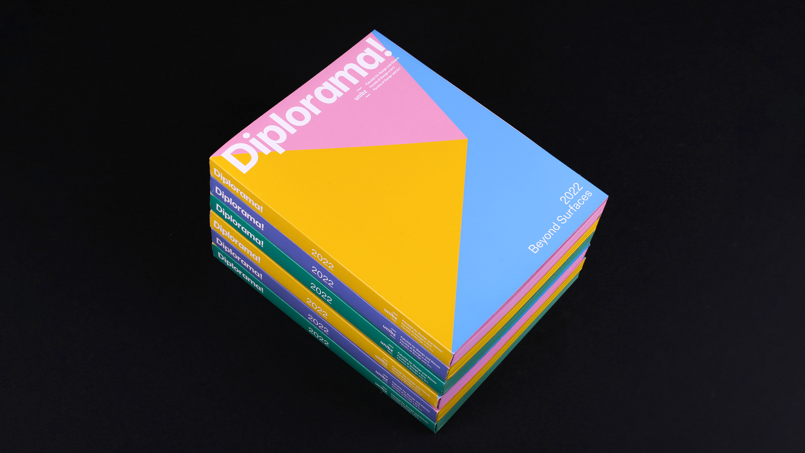
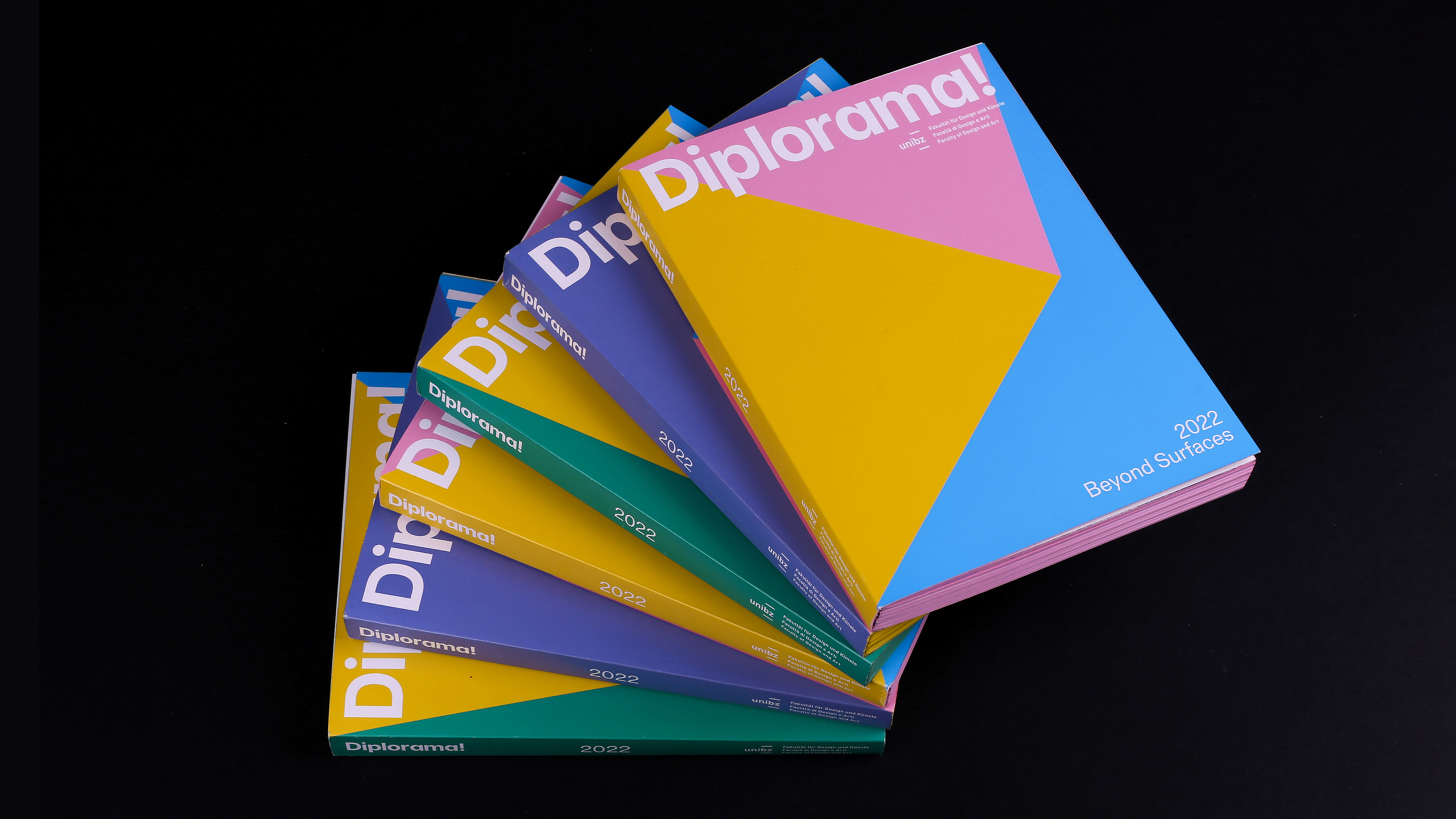
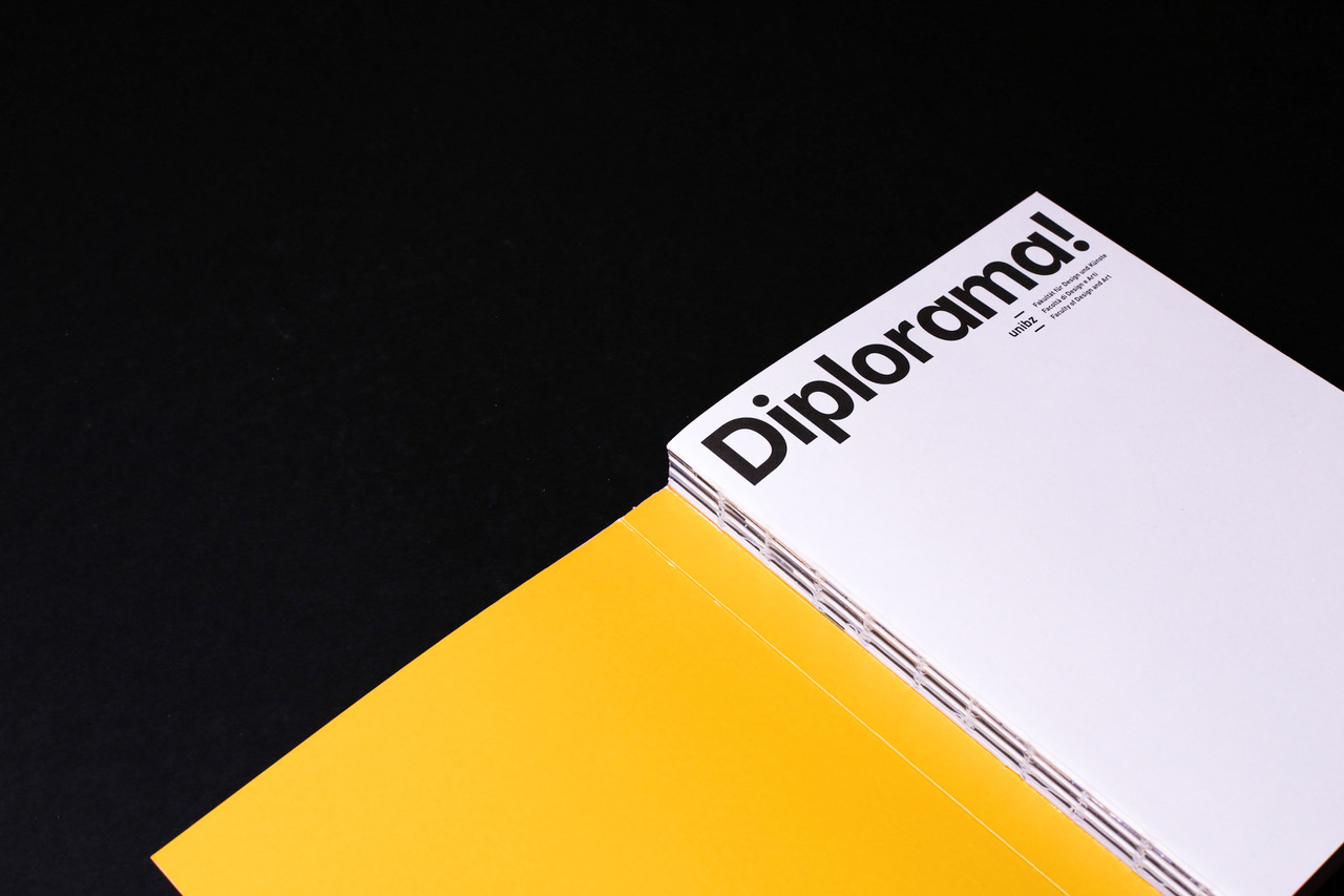
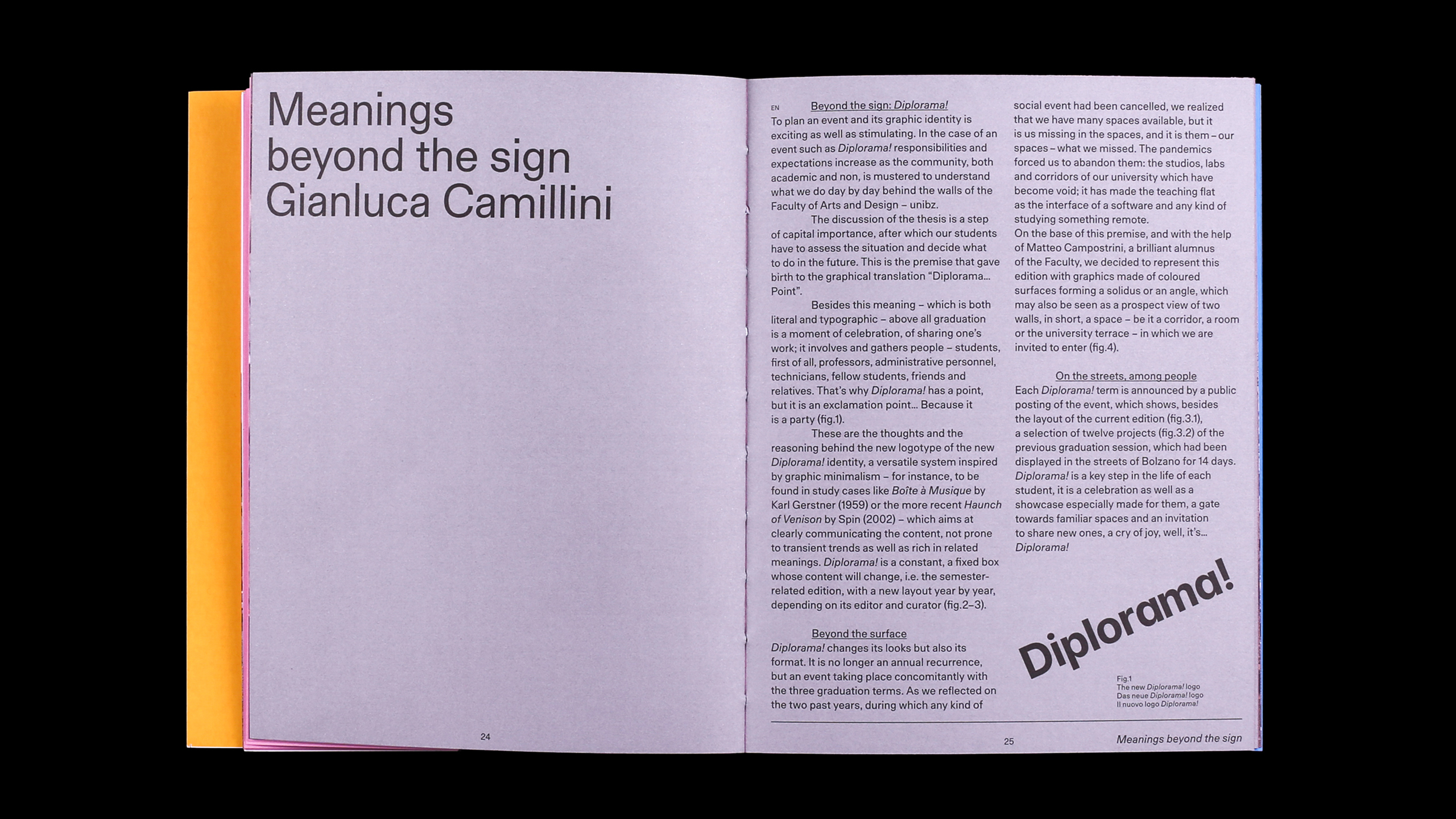
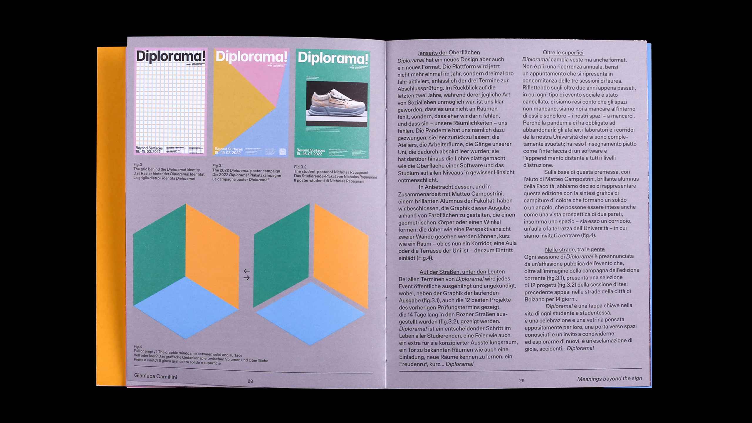
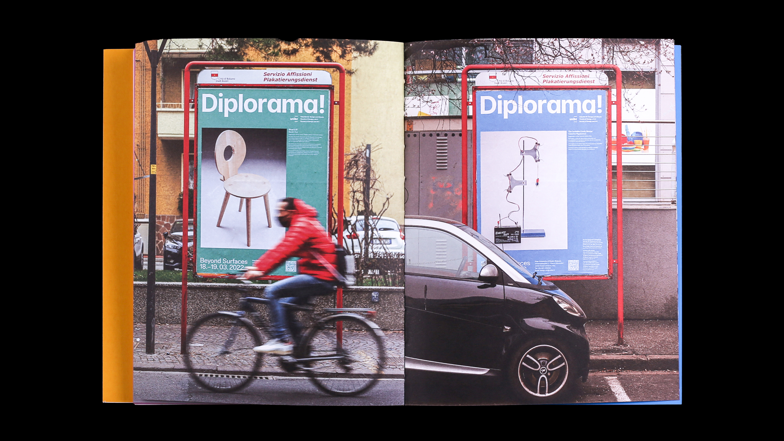
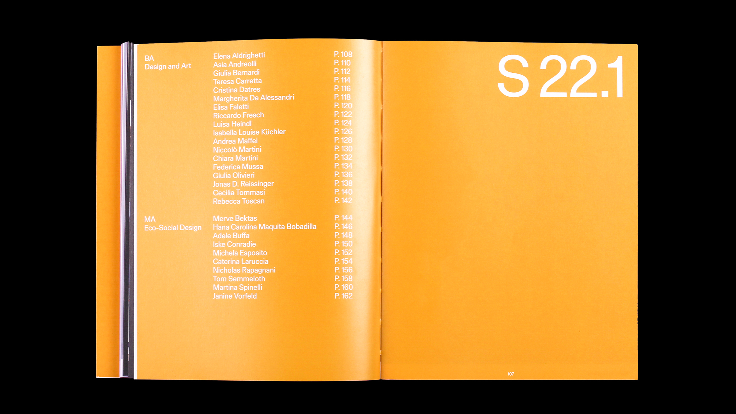
With the help of Matteo Campostrini, a brilliant designer and alumnus of the Faculty of Design and Art – unibz, we designed this year’s Diplorama identity with graphics made of coloured surfaces forming a solidus or an angle, which may also be seen as a prospect view of two walls, in short, a space – be it a corridor, a room or the university terrace – which we are invited to enter.
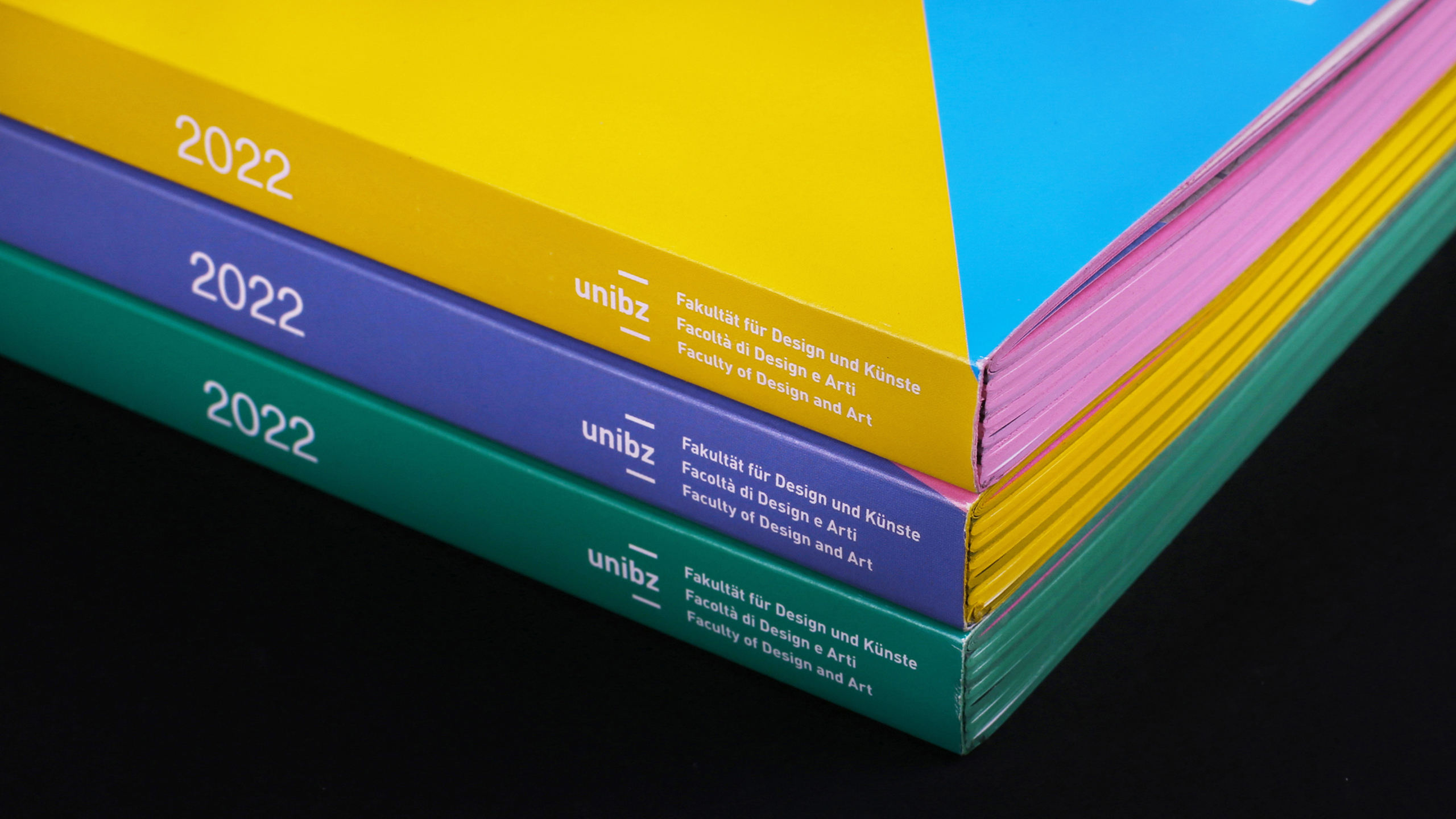
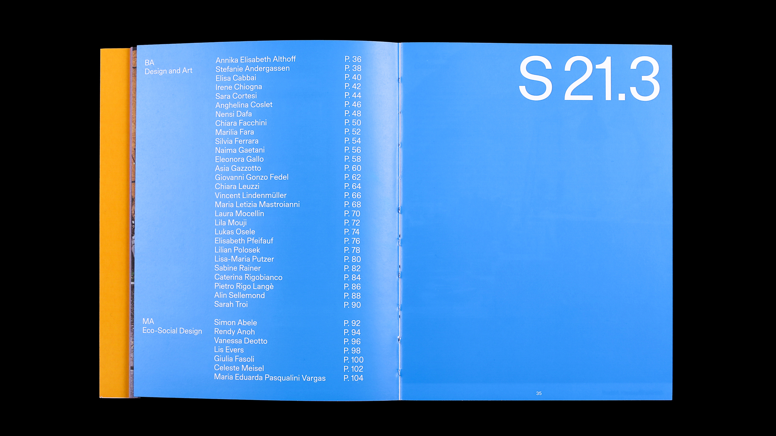
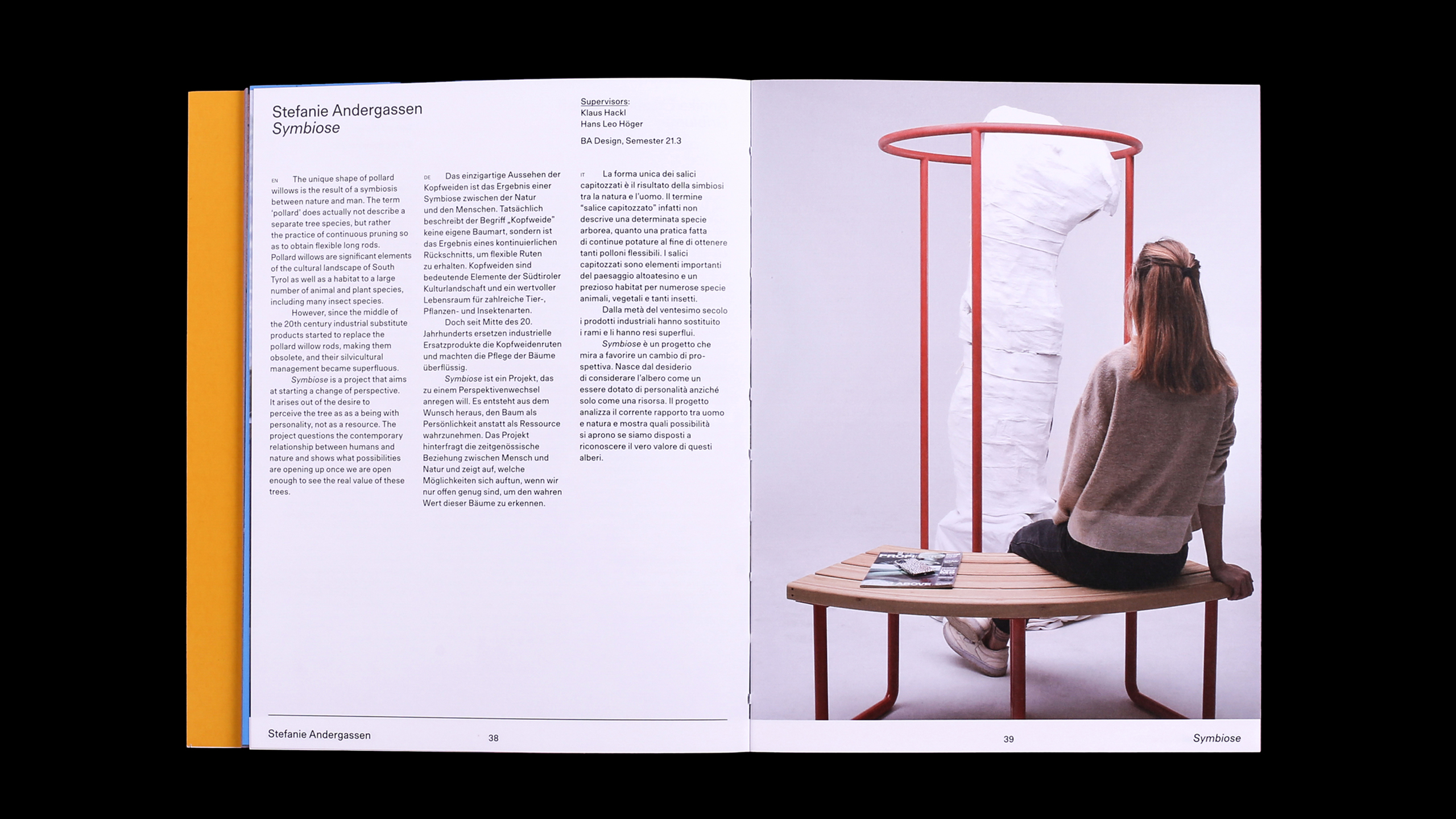
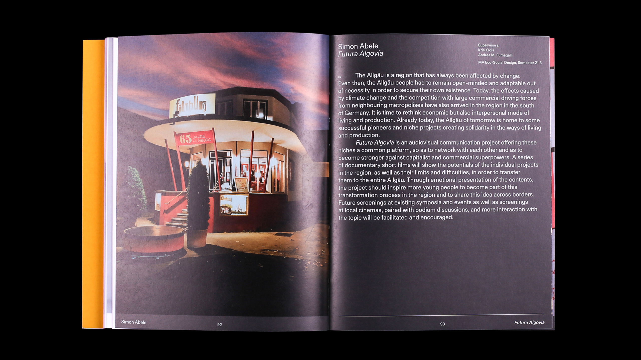
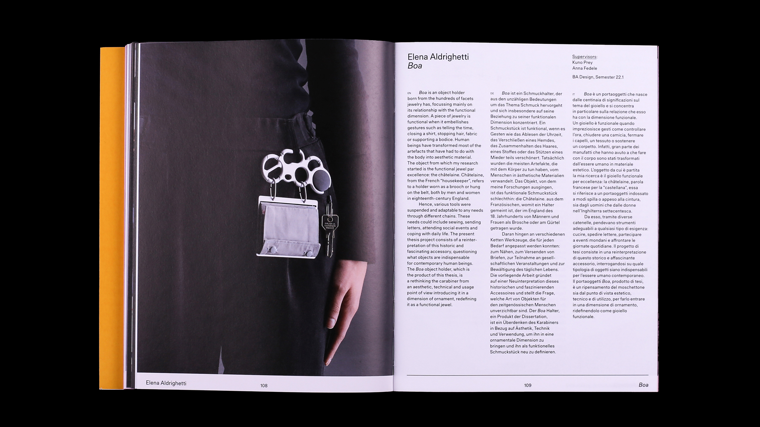
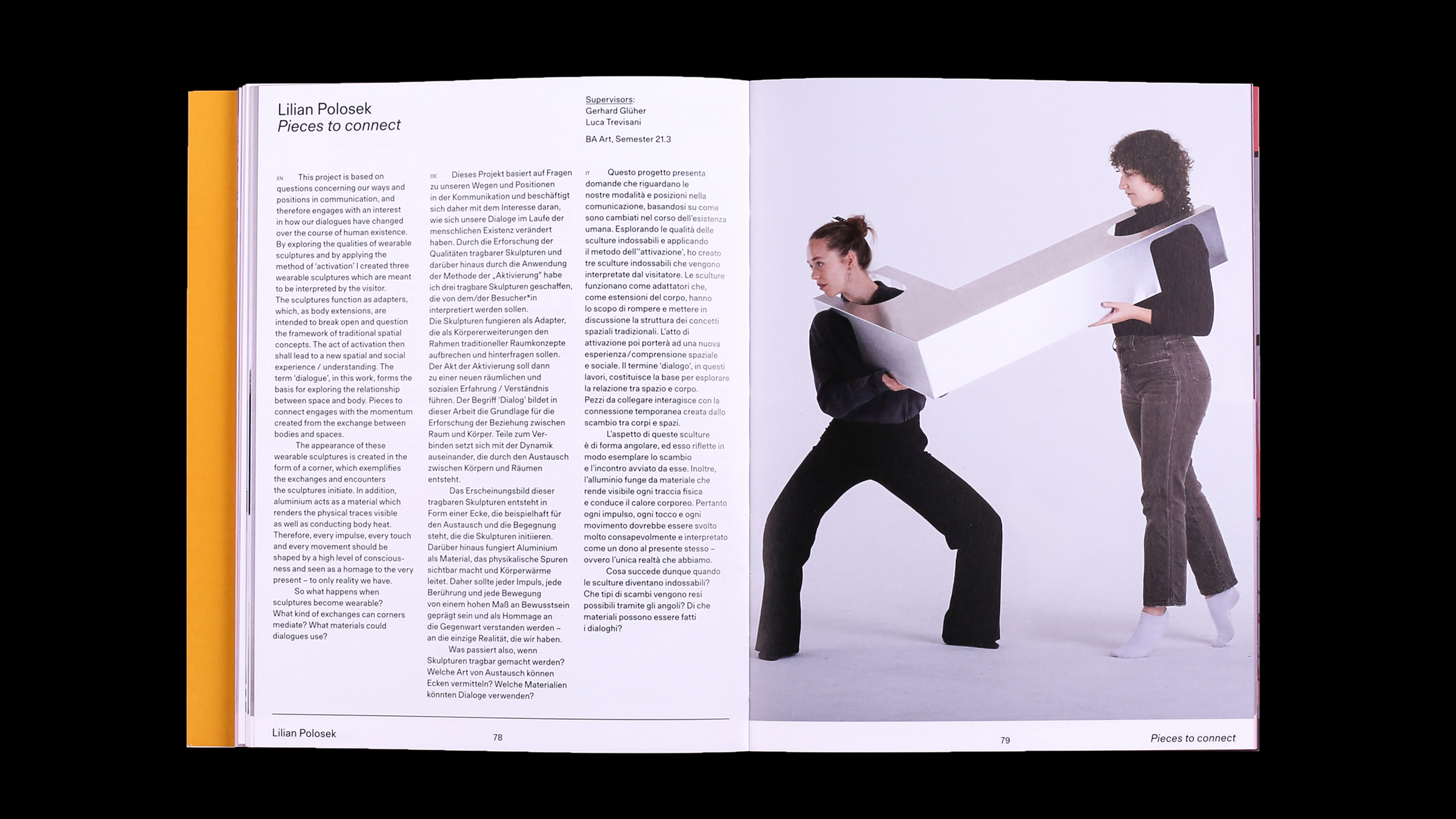
The catalogue follows the same idea, reflecting on the physical object made of three dimensions – cover, back cover, #book spine and side – which all are distinctive features of printed matter. These are shuffled and emphasised with a combination of colours in order to make the catalogue an actual space of debate and promotion. Looking at all projects collected in this year’s Diplorama catalogue is proof that art and design are in the right direction to tackle urgent matters and possibly avoid some of the next ones. Our students are now focusing on the circular economy, alternative materials and local natural resources, rethinking mobility, or provoking anti-consumerism and innovative sustainable ecosystems. They call for reflecting on the social dynamics of media and digitisation as much as on inclusiveness. Diplorama! is a key step in the life of each student, it is a celebration as well as a showcase especially made for them, a gate towards known spaces and an invitation to share new ones, a cry of joy, well, it’s… Diplorama!